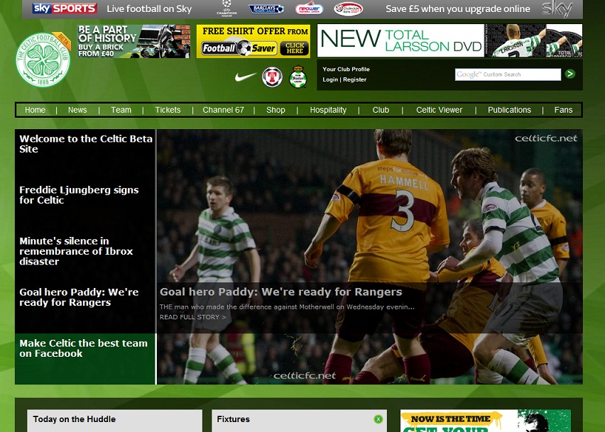
My guess is that a dedicated graphic designer was not used (well, there is an outside-chance that one was used so early in the process that his work has been eroded as the project has aged, but I doubt it).
There is no attention to detail. Spare pixels float around, images have jagged edges, and there’s no font consistency. There are very visible joins where third-party tools have been copy and pasted into the site. The size (and font size) of the news ticker is wholly inappropriate and overwhelms the page, the fixtures table has borders not seen since Netscape Navigator in late 1998, and the BBC Sport News fonts are too big, giving no breathing space around the text.
The plagiarised “Modify My Club Page” link at the bottom just gives credence to those who believe that the remit of the site was, “Man City, but cheaper.”
They appear to have concentrated on added-value items, but crucially forgot to get the basics right first.
Information Architecture
I can’t see that any thought has gone into the appropriate organisation of the site. Some of the category/sub-category combos are completely mystifying.
For instance, try to find the Celtic Pools section. Go on, I’ll wait until you come back.
That you done?
Right, unless you’d stumbled across it previously, I have no doubt that you only found the link to the Celtic Pools with trial and error. You probably just started to work your way across the navigation bar at the top, gave up, clicked on HOME, expecting to go back to the Home page and then found it on the slide-down menu.
Appropriate organisation of a website and its signposts are fundamental to a good site experience, and if this basic need isn’t met, your web project is doomed from the start. My preferred tool for getting this on the right track is the Card Sort (http://en.wikipedia.org/wiki/Card_sorting), and it’s very obvious that such techniques have been completely ignored.
Have a look at the other categories now and wonder how the hell they expect users to find the goodies within.
Try to find:
– Where to park your car
– How to sign up for the Celtic credit card.
One of the biggest oversights is on the First Team squad page. Go to http://beta.celticfc.net/team.php . You’ll have to look past the terrible jagged-edges of the players.
Now, imagine you don’t know what our players look like, or, even better, go and find someone else who doesn’t. Your/their task is to find Marc Crosas.
This lack of attention-to-detail just wouldn’t happen if the site was put together by a dedicated web studio. Celtic should have insisted upon and signed-off a content strategy way before the first word of code was committed.
Inconsistent Results
I’m a firm believer that if two links look the same, they should do the same thing. This builds up trust with your user and gives them confidence to work their way around the site without becoming as confused and disoriented as Daryl Murphy with the ball at his feet. Or anyone else’s feet.
If you haven’t already done so, work your way across the links in the main Navigation bar.
Incredibly, two of the innocent-looking links in the navigation bar whisk you away to a completely different website, breaking basic Web Development 101 rules.
Advertising
On the Internet, you don’t have to mass-market. The constant bombardment of the same animated GIFs dilutes all effectiveness. The Celtic website is not, and should never be, a copy of the Celtic View online.
News
I don’t understand why the News section has such a high prominence on the front page. Celtic are notoriously slow at releasing worthwhile statements, spam their own news section with photoshoots of their latest sales and offers, and most online fans will have their preferred source anyway.
And are they really going to start News Text Alerts in 2011? Surely there’s no-one out there still paying to receive premium text messages on their phones?
Source: http://beta.celticfc.net/mobile_newstextalerts.php
Geek Section
These days I’m more of a User Experience / Strategist, so I asked a well-respected developer colleague to take a look at the site and its underlying code.
Non-geeks can skip to the But it’s just a Beta, right? section.
- The DOCTYPE changes regularly, suggesting that an up-to-date templating system hasn’t been used. Pages seem to be put together ad-hoc with no forward planning.
- Lots of copy + paste JavaScript
- Seen this type of development before. Guess is that someone in charge on Celtic’s side has said they only have a tiny budget, and someone in charge on the web company side has promised the lot for a tiny price, then had to cut-corners big time to deliver.
- Amazingly the page is laid out in HTML data tables. This is a WTF? Any decent web developer stopped doing this about seven years ago.
- The code is littered with hardcoded CSS styles. Means that the next version will probably have to be written again from scratch.
- Some URLs use IDs rather than nouns. Not good for SEO / searching.
- Seems to have been rewritten from ASPX to PHP. It has been made from scratch and is probably worse than the version it’s replaced.
But it’s just a Beta, right?
No, not quite.
If proper procedures were followed, someone at Celtic should have signed-off initial picture designs, storyboards, wireframes and content strategy… all before a single piece of code was written. Once you start to program, changes become expensive – you’re not just tinkering or overhauling the design, you’ve also got to tackle the underlying wiring.
Public beta should be the very, very last thing you do before release. When you get there you should have first gone through local testing, client testing and closed alpha testing. Any significant changes at this time will take huge time and effort.
All evidence points to a, “make it up as you go along,” build. Celtic have taken their eye right off the ball with this, or more likely, weren’t aware that it’s their job to watch the thing.
Celtic FC online – overall
Fragmented brand
When you start to dig around the Celtic site, you are only a few clicks away from landing in a completely different sub-site. These are entirely stand-alone with different designs, navigations and buttons.
Brace yourself for some URLs;
– http://celticfc.net/ or http://beta.celticfc.net
– http://celticsuperstore.co.uk
– https://www.eticketing.co.uk/celtic
– The top-secret Celtic FC Rentals website.
I’ll go back to my esteemed web developer colleague. He’s barely interested in football, and not a Celtic fan.
“Why such a varied online presence? Who ever is in control of that lot needs sacking. For a football team’s website, it seems very unprofessional.”
This lack of cohesive style and delivery suggests that Celtic have absolutely no strategy, and no idea of how to share with the world their online brand. They may not even care, or possibly be so far detached from the online world in 2011 that they don’t realise it’s a problem.
What they do have is a collection of off-the-shelf solutions to individual problems. There is no thought for the end user, no attempts to make his or her journey through the site a pleasant one. For a company boasting a £70m annual turnover, this just isn’t good enough.
There are so many things that Celtic could be doing, and my basic recommendations would be:
Employ a dedicated “web guru” to love the website, properly love it. And as I am convinced that part of the problem is the existing Celtic media team leadership, this person should not report to the Media team, but to the Chief Executive.
Bring all of the sub-sites into a single site. Buying a brick and booking tickets shouldn’t be disparate. There is no need for six (seven soon) completely different websites. Madness.
Invite proper web studios to tender to complete the whole version, rather than phoning a friend.
Use advert profiling. There is no need in 2010 for mass-market adverts. Once again, the website is not the Celtic View online. Check my IP address… if I’m with Sky Broadband, there’s probably no need to waste pixels trying to get me to sign up to Sky. Likewise, if I never buy DVDs, then use the Ad space for something more appropriate.
Modern browsers are location-aware, so if a visitor is looking at the site from Mexico, there’s a chance that he’ll be more interested in Juarez than Forrest. Tweak the site to news about Juarez and Izzaguire. Try to sell him their shirts, in Spanish if you can find a translator. The technology is there.
And do it through a single portal.
Offer free hosting services for Celtic images and video. All of the wonderful pictures at The Celtic Wiki, and the thousands of club photographs uploaded to Imageshack or TinyPic, could all be deleted on a whim by their keepers. It is not difficult to provide image and video archiving for Celtic material, securing it for future generations.
Allow forums and blogs to hotlink the images or video in exchange for a tiny advert.
With this, I’d probably visit the main site every day.
Use psychology to anticipate why individuals are on specific pages, for instance, Gary Hooper’s page at http://beta.celticfc.net/player.php?id=41
It has a shite picture and shiter biography. Now, if someone is on that page, then there is a fair chance that they may be interested in:
- News where he features
- Buying a jersey with his name on it
- Injury news
- Link to his Twitter/Facebook pages (if he has them)
- Reading his thoughts in a quick blog.
None of this is there. Instead we have to make do with finding out that he plays for English and he has 6 goals from 7 appearances. What? Ah, right, that’s his Celtic appearances and goals shown in a way that makes it look like those are his International stats.
This site is the classic example of, “what can we put on the website?” not, “what do people want to see?” You got away with that ten years ago, but not now.
Use Social Effing Networking. I see that there are links to Twitter and Facebook in the “Fans” section*. I was pleasantly surprised until I did some digging and found this prototype:
And the Twitter page set up by someone in Celtic Media has collected dust since it was created
For social media to succeed, you have to interact with the fans. It is not the broadcast-only medium that Celtic seem most comfortable with. For that reason I can’t see it being embraced with anything stronger than a, “meh.”
* Incidentally, where in the ‘Fans’ sections are the links to forums, blogs, or even the incredible Celtic Wiki (once described to me by a non-football fan as, “probably the finest club online history in the world.”) Why is Celtic so ashamed of its online fan base?
So, who’s to blame?
To finish with a repeat of my earlier caveat, the person I feel most sorry for is the poor web developer who has just been following instruction, and was either misguided by a senior manager or left to make decisions that are not a developer’s to make.
Ultimately, while the developers may have changed, the new Beta site is brought to you by the same team at Celtic Park who oversaw the old site… and we get the same shite with a customisable background.
Celtic could be doing so much online; I’ve only just scraped the surface with my quick recommendations. But I genuinely believe that they just don’t get it. And someone, somewhere, at Celtic, is being paid a nice salary to not get it.


